Prerequisites Make sure you have installed the following R packages: tidyverse for data manipulation and visualization ggpubr for creating easily publication ready plots rstatix provides pipe-friendly R functions for easy statistical analyses.
1
library(ggpubr)
1
## Loading required package: ggplot2
1
## RStudio Community is a great place to get help: https://community.rstudio.com/c/tidyverse
1
2
3
## Registered S3 method overwritten by 'data.table':
##   method           from
##   print.data.table
1
library(rstatix)
1
2
##
## Attaching package: 'rstatix'
1
2
3
## The following object is masked from 'package:stats':
##
##     filter
1
2
3
4
5
6
# Transform `dose` into factor variable
df <- ToothGrowth
df$dose <- as.factor(df$dose)
# Add a random grouping variable
df$group <- factor(rep(c("grp1", "grp2"), 30))
head(df, 3)
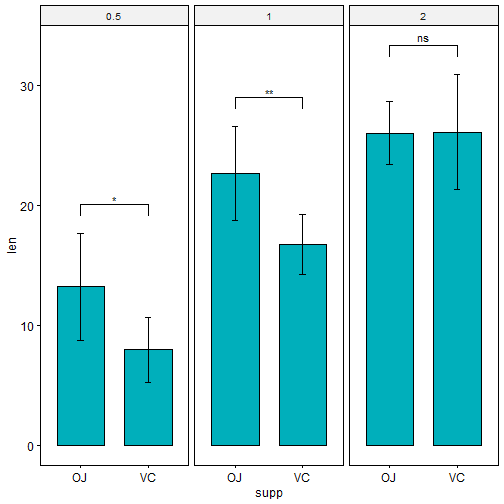
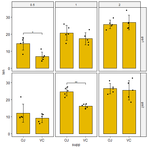
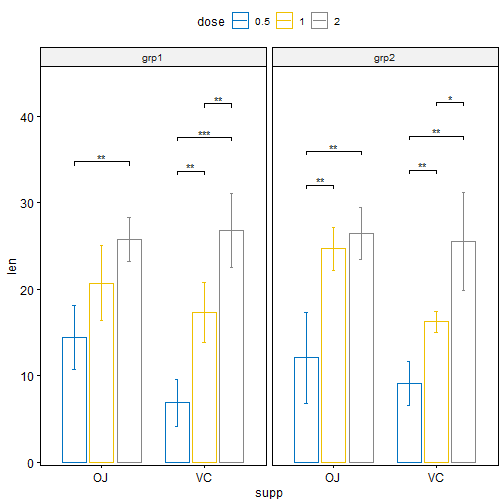
# Create a bar plot with error bars (mean +/- sd) bp <- ggbarplot( df, x = "supp", y = "len", add = "mean_sd", fill = "#00AFBB", facet.by = "dose" )
# Add p-values onto the bar plots stat.test <- stat.test %>% add_xy_position(fun = "mean_sd", x = "supp") bp + stat_pvalue_manual(stat.test)
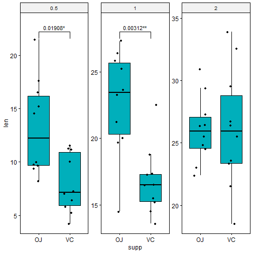
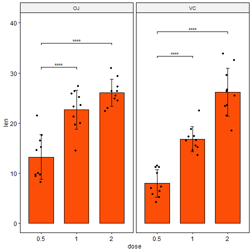
Bar plots with jitter points 在计算p-value标签的位置时,需要设定fun = “max”, 从而将括号将从数据点的最大值开始,避免数据点和括号之间的重叠。
1 2 3 4 5 6 7 8 9
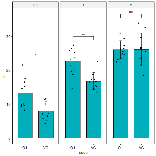
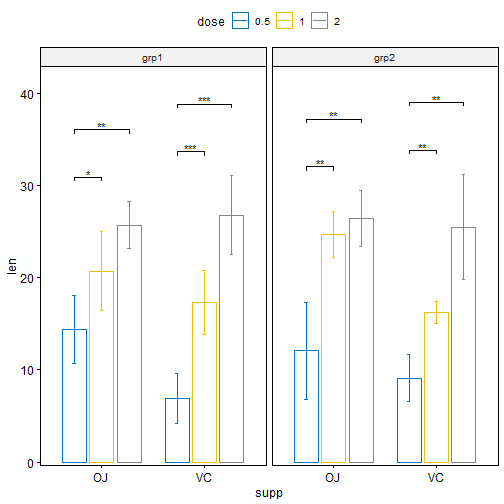
# Create a bar plot with error bars (mean +/- sd)
bp <- ggbarplot(
  df, x = "supp", y = "len", add = c("mean_sd", "jitter"),
  fill = "#00AFBB", facet.by = "dose"
  )

# Add p-values onto the bar plots
stat.test <- stat.test %>% add_xy_position(fun = "max", x = "supp")
bp + stat_pvalue_manual(stat.test)
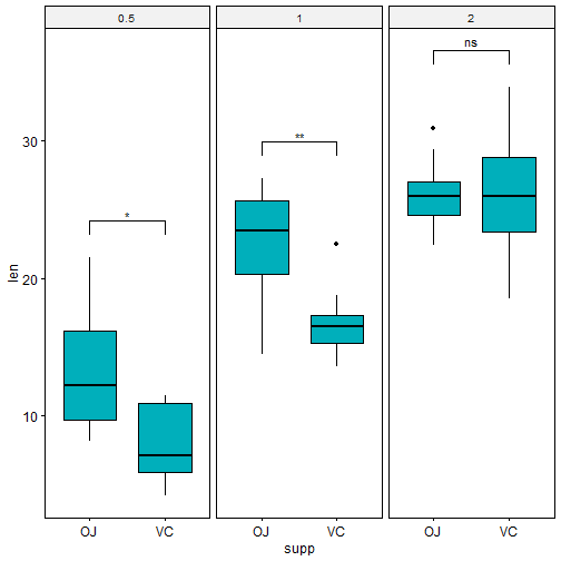
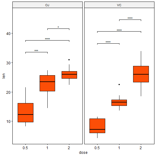
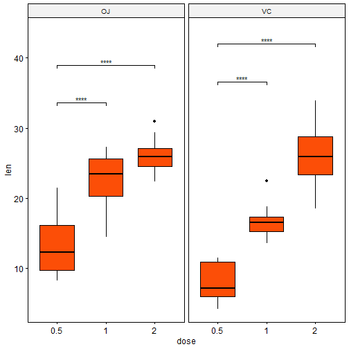
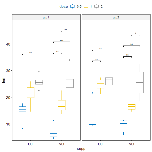
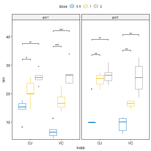
# Show only significance levels at x = group2 # Move down significance symbols using vjust stat.test <- stat.test %>% add_y_position() ggboxplot(df, x = "dose", y = "len", fill = "#FC4E07", facet.by = "supp") + stat_pvalue_manual(stat.test, label = "p.adj.signif", x = "group2", vjust = 2)
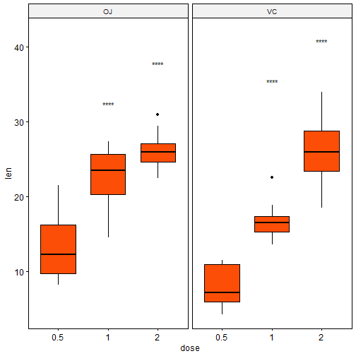
Bar plot
1 2 3 4 5 6 7 8
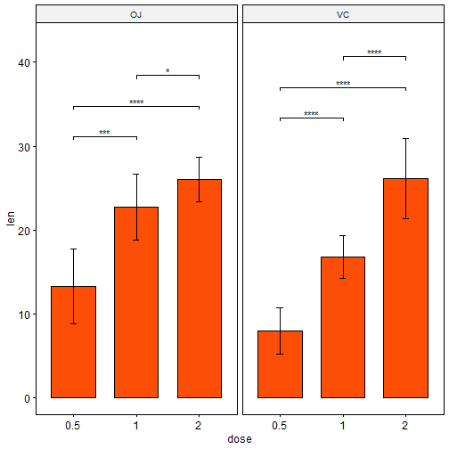
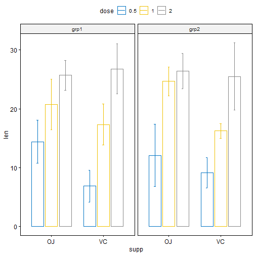
# Add 10% space on the y-axis above the box plots
stat.test <- stat.test %>% add_y_position(fun = "mean_sd")
ggbarplot(
  df, x = "dose", y = "len", fill = "#FC4E07",
  add = c("mean_sd", "jitter"), facet.by = "supp"
  ) +
  stat_pvalue_manual(stat.test,  label = "p.adj.signif", tip.length = 0.01) +
  scale_y_continuous(expand = expansion(mult = c(0.05, 0.1)))
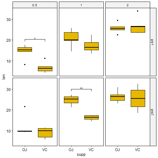
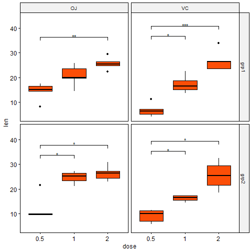
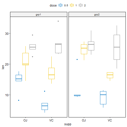
使用两个变量进行分面
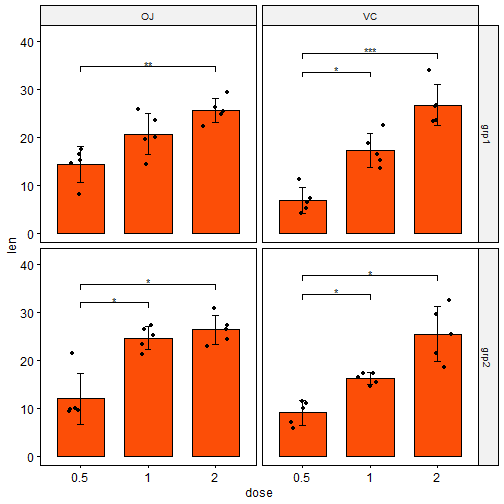
Statistical test 使用dose和group变量进行分面,并在x轴上水平上比较supp变量。